What is mobile first design?
Rachel Wing
August 1, 2023
It is absolutely critical that your website looks stellar on mobile! In 2023, roughly 60% of all online traffic comes from mobile devices rather than desktop - in other words, 3 out of every 5 people who visit your website, will visit on their phone instead of their computer.
Common payment platforms like Apple Pay, Paypal, and Venmo make it even more likely that website visitors will make purchases directly from their phones.
In my personal experience, I used to browse websites on my phone, but save the serious stuff (e.g. actual purchases or inquiries) for my laptop - but recently, I go ahead and make the purchase on my phone from the couch or even on the go.
If users need to switch from their phones to their laptops, it is a huge bounce risk - they may never come back and complete the transaction.


Mobile first design
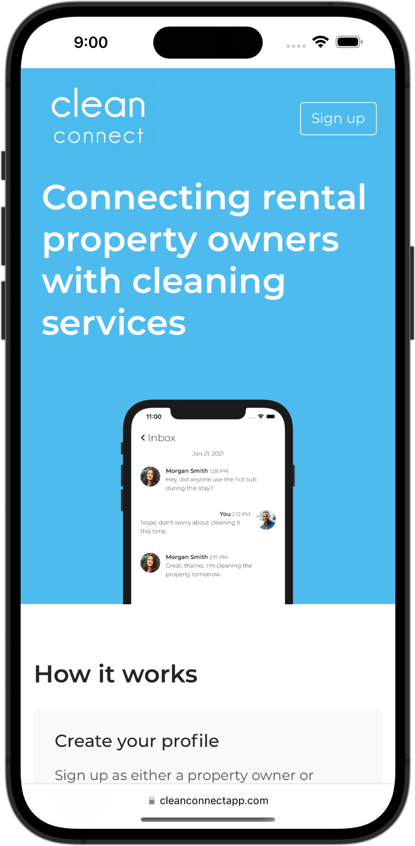
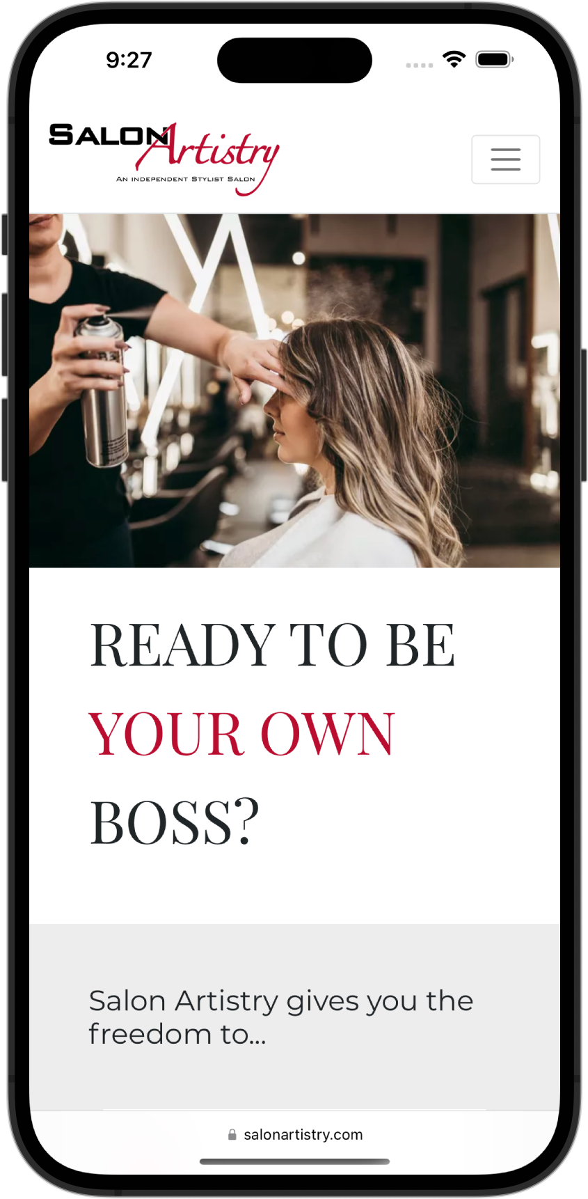
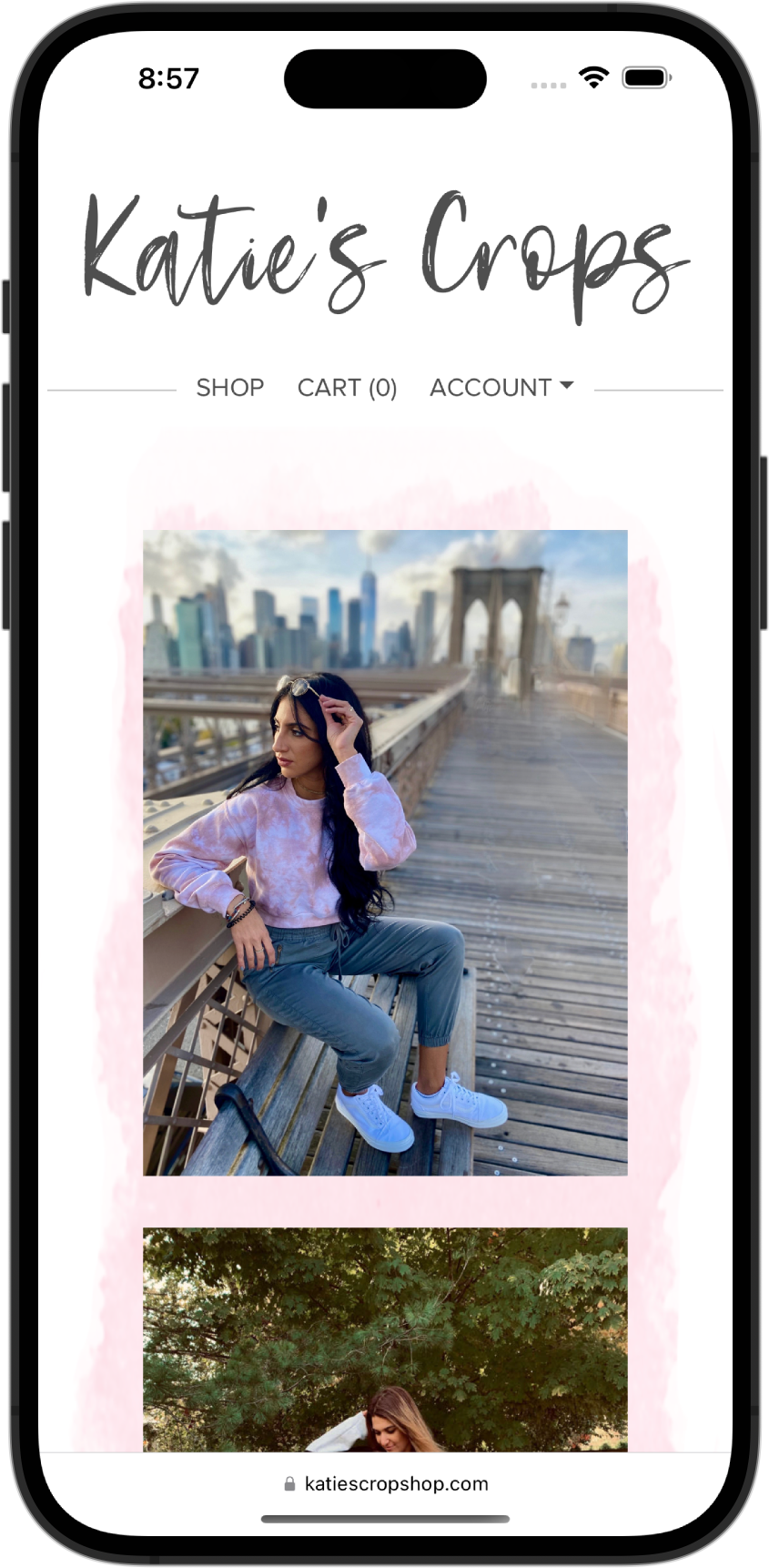
"Mobile first" means that we design your website specifically with phones in mind. We then design and create a similar, but different version for big screens like laptops and desktops.
Mobile first vs mobile friendly
This seems like old news, right? Since smartphones came into existence, it has been important for websites to look good on phones. We've been making our websites mobile friendly for many years. Mobile friendly sites are designed for desktop versions and then made to look good on phones after the fact. This is of course a HUGE step up compared to websites that are not adaptive at all to mobile devices - where design elements overlap or is the wrong size - or sometimes is simply entirely unusable. However, when mobile is an afterthought, it is unlikely to look as wonderful as when mobile workflow is designed for first. A good analogy for mobile friendly websites is a great book that is later turned into a movie. Sometimes the movie is still good, but it always feels like the book was better - which makes sense, since the entire experience was designed for a reader, rather than a movie viewer.

Why is mobile first design important?
First and foremost - laptops and desktops screens are wider than they are tall, while mobile devices are the opposite - taller than they are wide. So, a design that works well on desktop - like, for example, 3 services listed in a horizontal row, is unlikely to work on a phone. Additionally, on mobile, you have much less real estate to look at - the user sees much less of the site in any one view. Often, this means a mobile design needs less white space and more color - fonts may need to be entirely different sizes than on a computer. We also often use less text on mobile, since people rarely want to read a wall of text (or scroll forever!) on their phone.Further, the user journey and user expectation may be very different on mobile. For example, the user may want to quickly check the hours for a coffee shop or the menu for a restaurant. For a really delightful user experience, you'll want to plan for this and make this information easily accessible and prominently displayed for your users.
Finally, the workflow is different - on a phone you are using your finger to scroll, while on a computer, you may be using a mouse. That means, on a computer, the user can hover over buttons to see if they are links, etc - this functionality won't exist on mobile, so it is important to make the workflow easy and intuitive.
