4 tips to optimize your website's photos
Rachel Wing
April 28, 2023
Today, we're talking about photos! Here are our top tips for using photos on your website.
1. Be intentional about colors
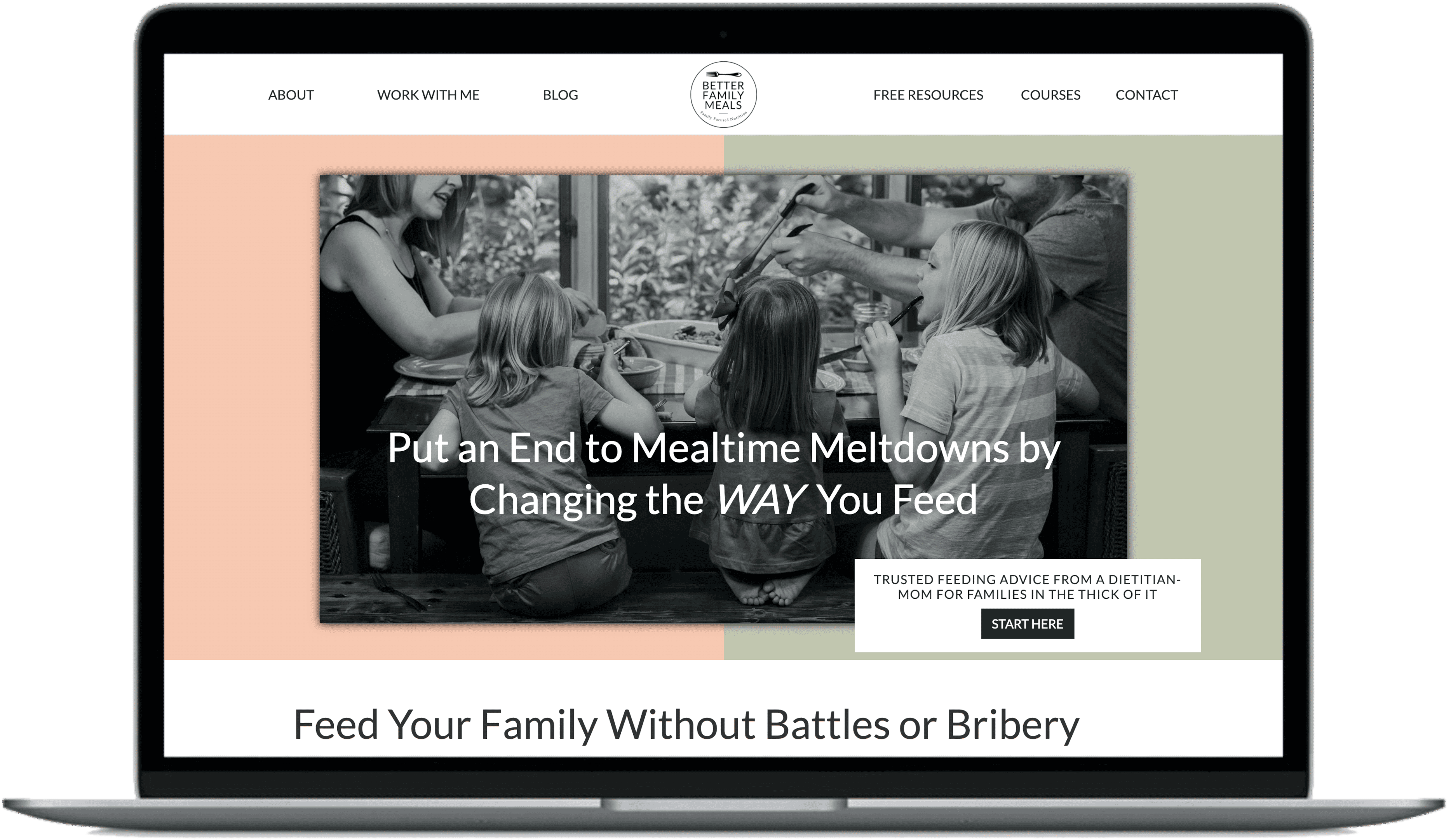
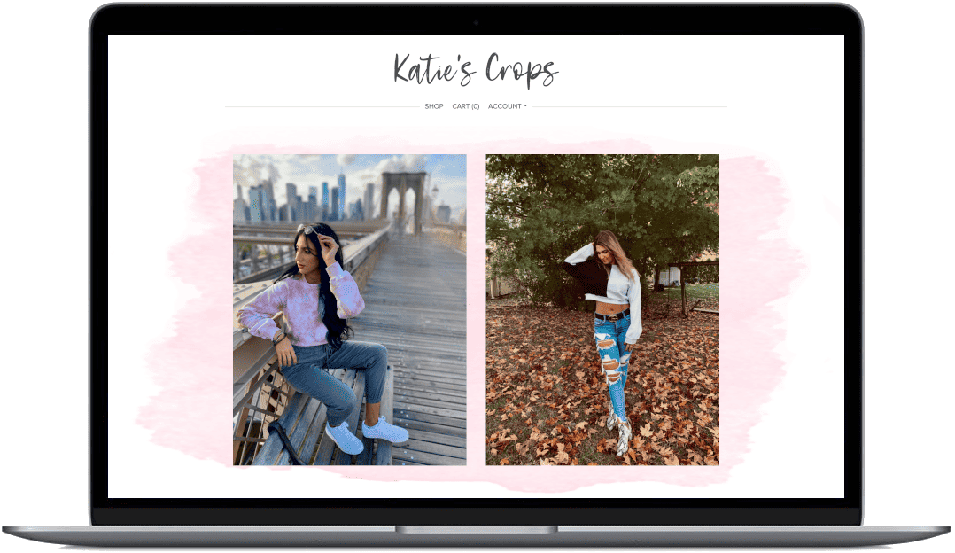
Color helps direct the user on where to look as they browse your website. We typically recommend using photos with colors that match the website's aesthetic. For example, if your aesthetic is mostly blues, consider using photos with the subject wearing blues, greens, or neutrals.On the other hand, a color that stands out from your palette can be used intentionally to attract attention to a key image or key part of an image.
Whenever possible, the most important part of an image should be the only thing of that color. That helps a user quickly see and understand the photo.

2. Keep the background clean and simple
Remember, the background is as important as the foreground. Make it easy for users to see the important parts of the photo with just a quick glance at the image.Don't let the background be a distraction. For example, if you are highlighting a cupcake for your bakery website, make sure the background is clear of utensils or mess from the baking process.
Many people will quickly scroll through, so it is important to hit the key points both in text as well as photos. Photo backgrounds should be tidy and simple. If all else fails, blur the background to help focus the user on the foreground.


3. Try to avoid stock images
Stock photos have a very generic feel and are often used by multiple brands. Meaning your website won't look (or actually be) unique.That said, stock images are a fine place to start if you don't have professional quality images. The good news about stock images is that they are high resolution. We can help you balance custom photos in key places with a few stock images in less important locations.

4. Use high resolution photos
We can't say this enough! Low resolution photos make your website and brand look unprofessional and even outdated. There's never a reason to use low resolution, grainy images. Always avoid these. If low resolution photos are all you have, start with stock photos or use graphics instead of photos. Just leave the low resolution images out!