8 tips for mobile first website design
Rachel Wing
August 8, 2023
Mobile First website design is absolutely the way of the future. You can read all of our thoughts on mobile-first design and why we use it here.
To make this a bit more tangible, here are eight tips for Mobile First Website Design. In particular, we highlight elements that are *different* than what one might do for Mobile Friendly (aka computer-first) design.
To make this a bit more tangible, here are eight tips for Mobile First Website Design. In particular, we highlight elements that are *different* than what one might do for Mobile Friendly (aka computer-first) design.
1. Ensure E-Commerce check out experience is seamless on mobile
Include plugins for apple pay, paypal, and/or venmo to reduce friction at check out. You want to avoid any reason for the user to stop the check out process on their phone - needing to find a computer to check out is a huge risk to losing customers. Similarly, be intentional about the check out workflow - if there are places to simplify and reduce clicks, do so.
2. Use less white space
The field of view is really small on a phone, so the amount of white space that feels intuitive to the user is much less on mobile than it is on a desktop. The user may only see a photo and a few sentences, or perhaps a few short bullets. We aim to use enough white space so that the elements aren't crowded, but not so much that the website feels very long (or empty) and the user must scroll for a long time to reach the content.
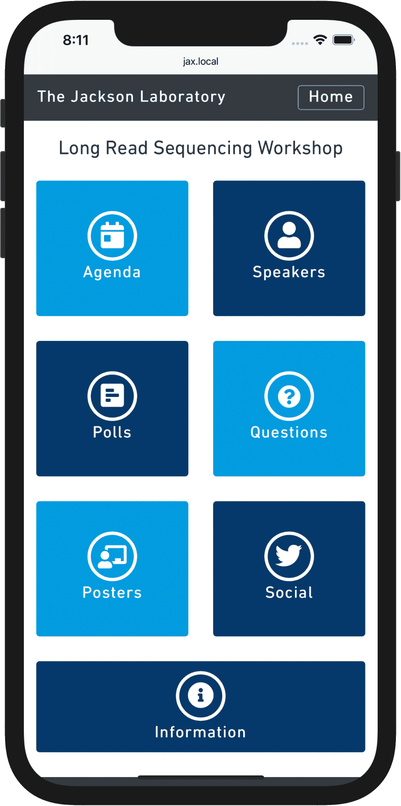

3. Only include message-critical components
Since phone screens are fairly small, a lot of content means a lot of scrolling. Don't use 3 photos when 1 gets the message across; don't use 5 paragraphs when one would do. Shorten your headers to critical messages so that they don't take up too many lines. On wide-screen (desktop) designs, we have a lot of space and it is often nice to fill the space with design elements that help reinforce messages - on mobile that is really not needed and ends up just feeling redundant.
4. Design with the mobile experience in mind
Computer screens are wider than they are tall, while phone screens are taller than they are wide. Therefore, there are many design elements that you may be used to working with on desktop-first sites that should be avoided on mobile sites. For example, a layout with 3 elements in a horizontal row (e.g. 3 Services listed side by side) is common on desktop, but should be avoided on mobile.
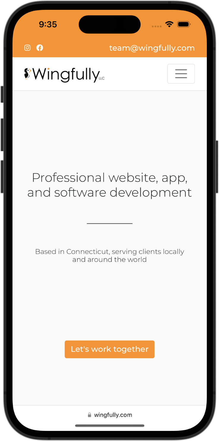
5. Use a “hamburger” menu bar
Since phones are not wide enough to show multiple tabs on a horizontal fashion, use a hamburger (3 lines) menu to intuitively convey that the menu is hidden and can be viewed by tapping the hamburger menu.
6. Exclude elements that are not delightful on mobile
There may be entire elements that you may include on desktop but not mobile or vice versa. For example, while maps may be nice on desktop, we find they often irritate users on mobile - since the map tries to scroll or change positions when the user wants to scroll past it. On mobile, users will simply use a native maps app, so all you need to provide is the address (no map required!).
7. Make button placement intuitive
For mobile layouts, consider placing buttons for high frequency workflows in areas that are easy to reach with a thumb while holding a phone.
8. Use more color
Make sure to incorporate color and branding throughout - even with the small field of view the user will have at any moment, it is important that the website come across as uniquely branded and a clear representation of your organization.